
The Countdown widget from Wow Elements allows you to display a dynamic timer that counts down to a specific date or event in a visually engaging way. It’s perfect for promoting upcoming launches, limited-time offers, or special events while creating a sense of urgency that encourages user action. With flexible customization options and real-time countdown functionality, you can easily style the timer to match your website design. This guide will walk you through how to use and customize the Countdown widget in Elementor.
Enable The Countdown Widget #
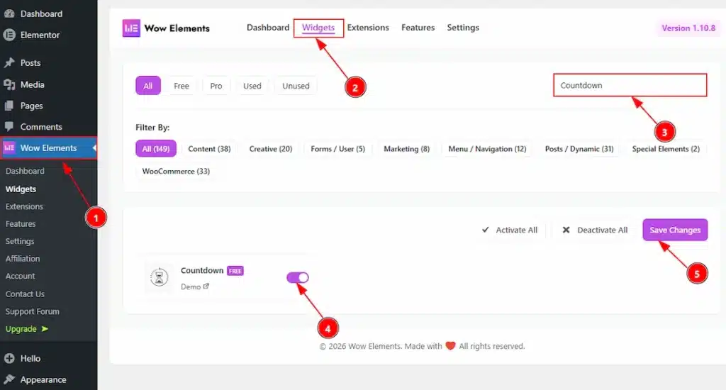
To use the Countdown widget from Wow Elements, first, you have to enable the widget.
- Go to WordPress dashboard → Wow Elements Plugin dashboard.
- Then, Click the Core Widgets Tab.
- Search the Countdown Widget Name.
- Enable the Countdown Widget.
- Hit the Save Settings Button.
Inserting The Countdown Widget #
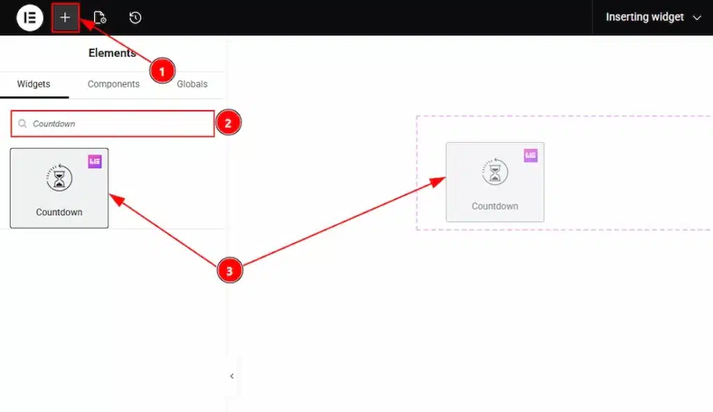
1. Go to the Elementor Editor Page and hit the “+” icon Button.
2. Search the Countdown name.
3. Drag the widget and drop it on the editor page.
Content Tab Overview of Countdown Widget #
Layout Section #
Go to Content → Layout
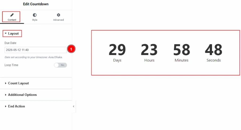
1. Due Date: You can set the due date here so the countdown will roll the timer until the specific due date arrive.
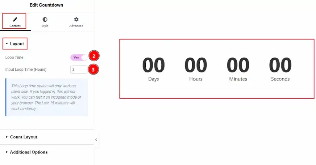
2. Loop Time: Enable the switcher to restart the countdown automatically after reaching zero for continuous looping.
3. Input Loop Time (Hours): You can set the duration (in hours) for each countdown cycle before reset and start again.
Count Layout Section #
Go to Content → Count Layout
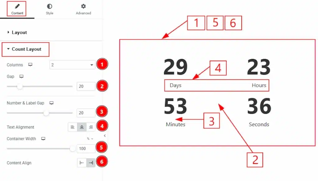
1. Columns: You can set how many column you want to show to present the countdown to your audience with this option.
2. Gap: You can adjust the space between the countdown elements with this option.
3. Number & Label Gap: You can adjust the space between the number and the label with this option.
4. Text Alignment: You can adjust the alignment of the label to left, center or right with this option.
5. Container Width: You can adjust the width of the container with this option.
6. Content Align: You can set the position of the content to left or right with this option.
Additional Options Section #
Go to Content → Additional Options
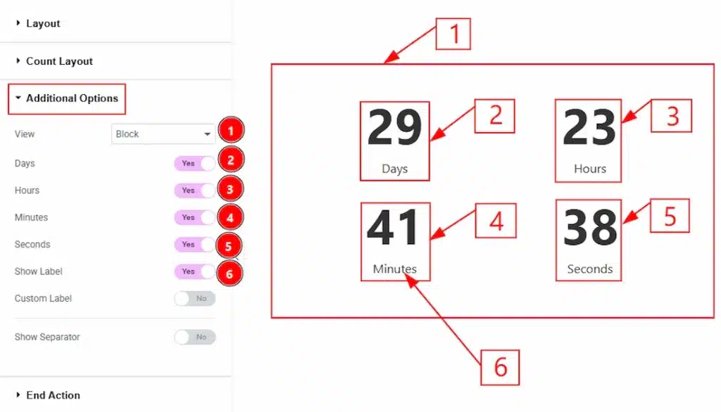
1. View: You can select the countdown visual layout to Block or Inline with this option.
2. Days: Enable the switcher to show the days countdown to your audience.
3. Hours: Enable the switcher to show the hours countdown to your audience.
4. Minutes: Enable the switcher to show the minutes countdown to your audience.
5. Seconds: Enable the switcher to show the seconds countdown to your audience.
6. Show Label: Enable the switcher to show the label’s of the days, hours, minutes & seconds with this option.
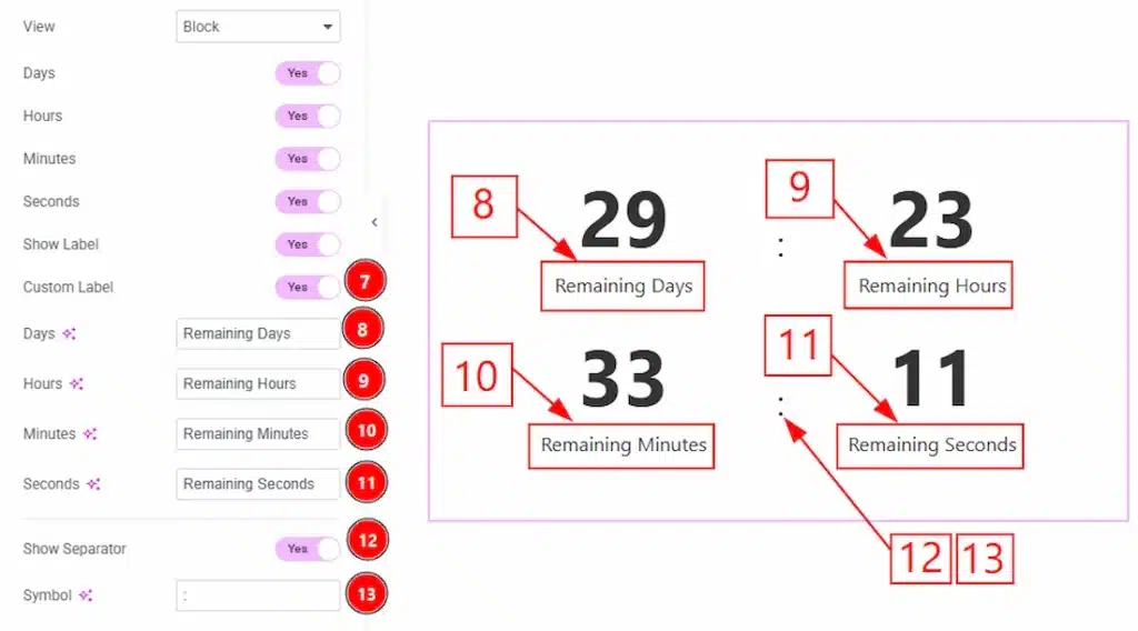
7. Custom Label: You can enable the switcher to make changes the label as you prefer with this option.
8. Days: You can make changes to the label of the days field with this option.
9. Hours: You can make changes to the label of the hours field with this option.
10. Minutes: You can make changes to the label of the minutes field with this option.
11. Seconds: You can make changes to the label of the seconds field with this option.
12. Show Separator: Enable the switcher to show the separator between the countdown with this option.
13. Symbol: You can make changes to the separator symbol with this option.
End Action Section #
Go to Content → End Action
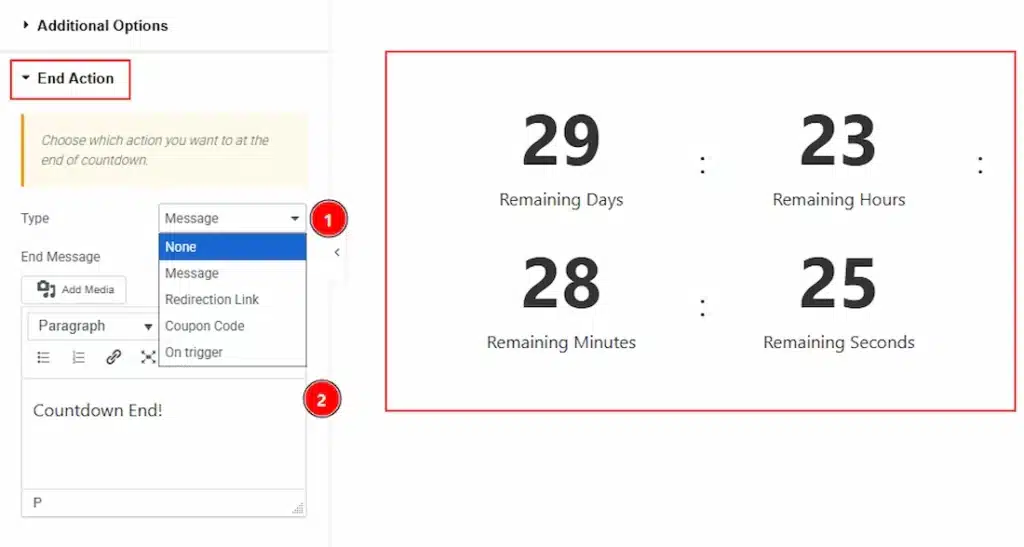
1. Type: You can choose which action you want to show to your audience at the end of countdown with this option. You can choose between the none, message, redirection link, coupon code & on trigger end action type.
2. End Message: You can add the end message here.
Style Tab Overview of Countdown Widget #
Item Style Section #
Go to Style → Item Style
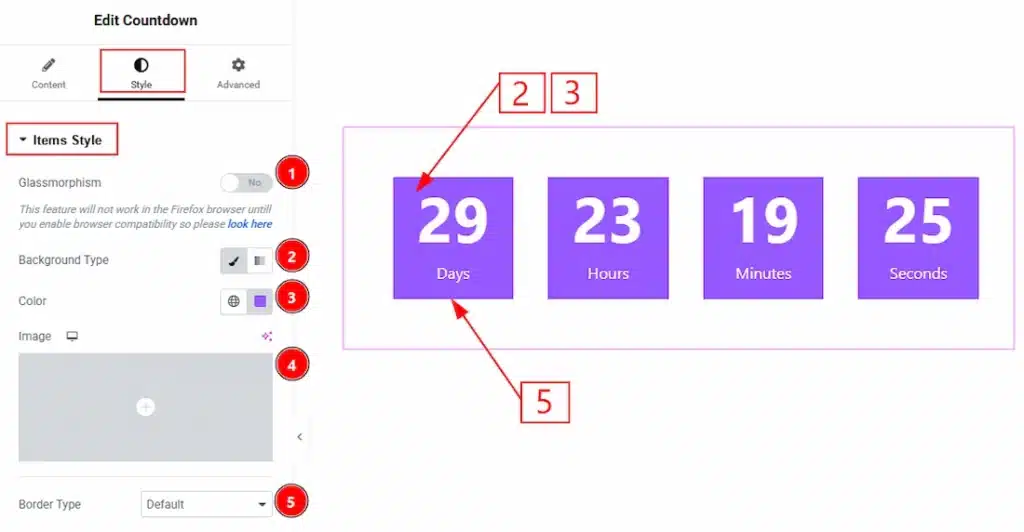
1. Glassmorphism: This option allows you to set a blurriness effect to the countdowns.
2. Background Type: You can choose the background type to be classic or gradient with this option. Here we choose the Background type Classic.
3. Color: This option lets you change the items background color.
4. Image: You can change the background image with this option.
5. Border Type: You can set the Border Type to Default, None, Solid, Double, Dotted, Dashed, or Groove. We choose here the Border Type as default.
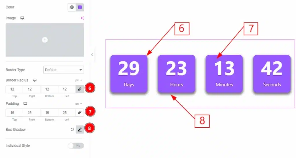
6. Border Radius: You can control the roundness of the border with this option.
7. Padding: You can adjust the inner space of the countdown field with this option.
8. Box Shadow: You can add a shadow effect to the countdown items with this option.
Below, you will get to see the individual style option. By enable this option you will get the customization options for each countdown items. Such as Days, Hours, Minutes & Seconds separately. Let’s see what we have in those separate customization option.
Days Style Section #
Go to Style → Days Style
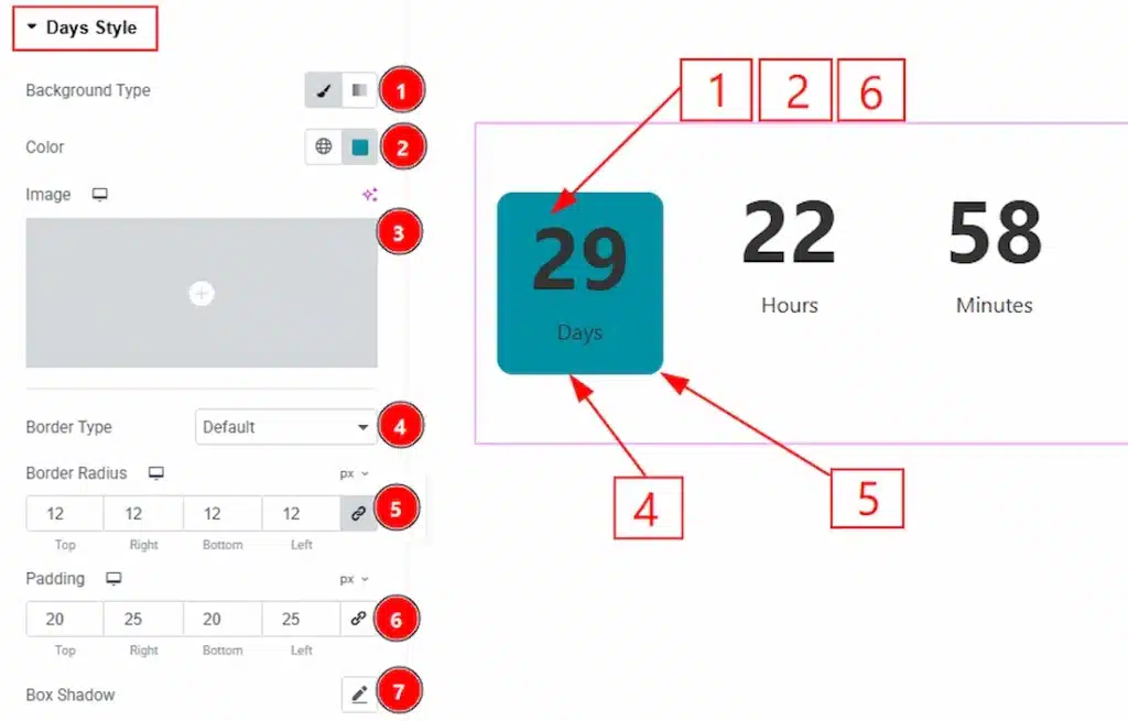
1. Background Type: You can choose the background type to be classic or gradient with this option. Here we have selected the background type as Classic.
2. Color: You can change the background color with this option.
3. Image: You can change the background image with this option.
4. Border Type: You can add and change the border types with this option.
5. Border Radius: You can control the roundness of the border with this option.
6. Padding: You can adjust the inner space of the days countdown item field with this option.
7. Box Shadow: You can add a shadow effect to the days countdown item with this option.
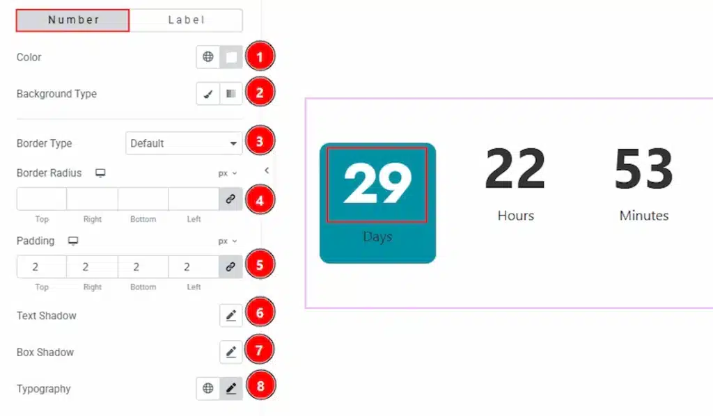
In this section, we have two more tabs. These are Number and Label. Let’s proceed with the Number tab section first-
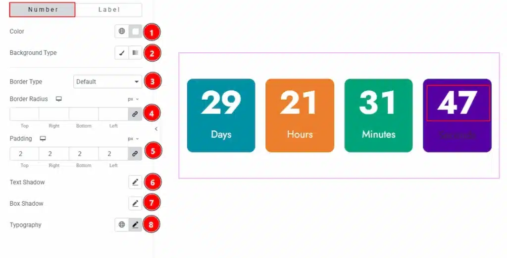
1. Color: You can change the day item countdown number color with this option.
2. Background Type: You can change the background type to be classic or gradient with this option.
3. Border Type: You can add and change the border type with this option.
4. Border Radius: You can control the roundness of the border with this option.
5. Padding: You can adjust the inner space of the day item’s number area with this option.
7. Box Shadow: You can add a shadow effect to the day item’s number with this option.
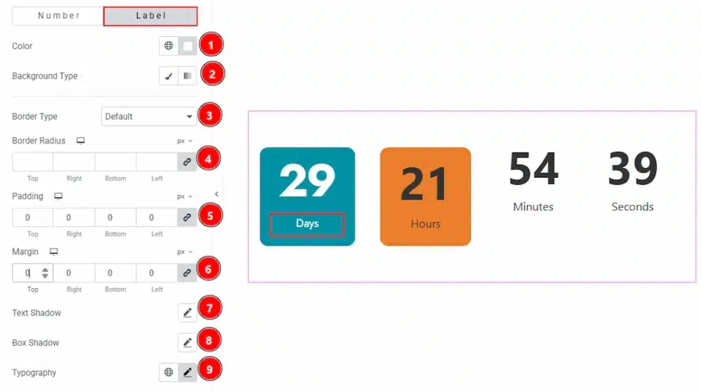
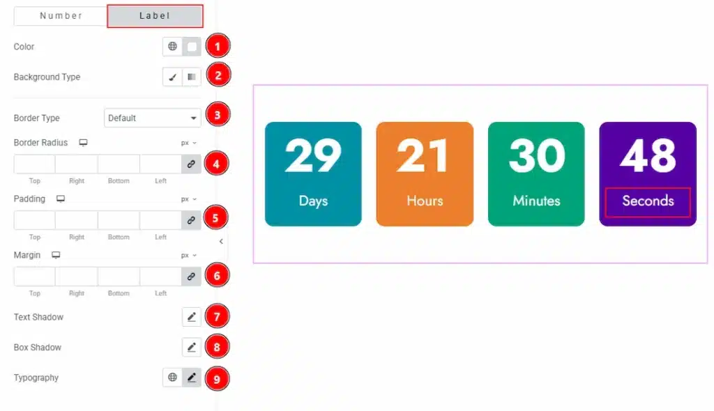
Now, let’s proceed with the Label tab-
1. Color: You can change the label color of the day item with this option.
2. Background Type: You can choose the background type to be classic or gradient with this option.
3. Border Type: You can add and change the border types with this option.
4. Border Radius: You can control the roundness of the border with this option.
5. Padding: You can adjust the inner space of the days item’s label with this option.
6. Margin: You can adjust the space around the label ot the day items with this option.
7. Text Shadow: You can add a shadow effect to the label text with this option.
8. Box Shadow: You can add a shadow effect to the label field with this option.
9. Typography: Change the font family, size, weight, transform, style, decoration, line height, letter spacing, and word spacing from here.
Hours Style Section #
Go to Style → Hours Style
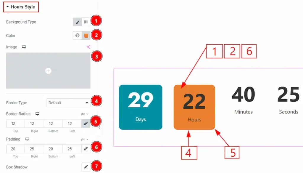
1. Background Type: You can choose the background type to be classic or gradient with this option. Here we have selected the background type as Classic.
2. Color: You can change the background color with this option.
3. Image: You can change the background image with this option.
4. Border Type: You can add and change the border types with this option.
5. Border Radius: You can control the roundness of the border with this option.
6. Padding: You can adjust the inner space of the hours countdown item field with this option.
7. Box Shadow: You can add a shadow effect to the hours countdown item with this option.
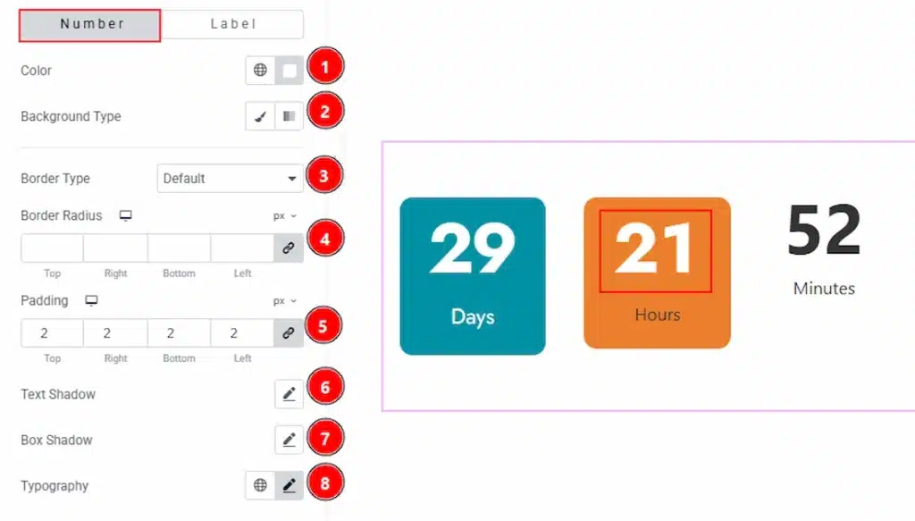
In this section, we have two more tabs. These are Number and Label. Let’s proceed with the Number tab section first-
1. Color: You can change the hours item countdown number color with this option.
2. Background Type: You can change the background type to be classic or gradient with this option.
3. Border Type: You can add and change the border type with this option.
4. Border Radius: You can control the roundness of the border with this option.
5. Padding: You can adjust the inner space of the hours item’s number area with this option.
7. Box Shadow: You can add a shadow effect to the hours item’s number with this option.
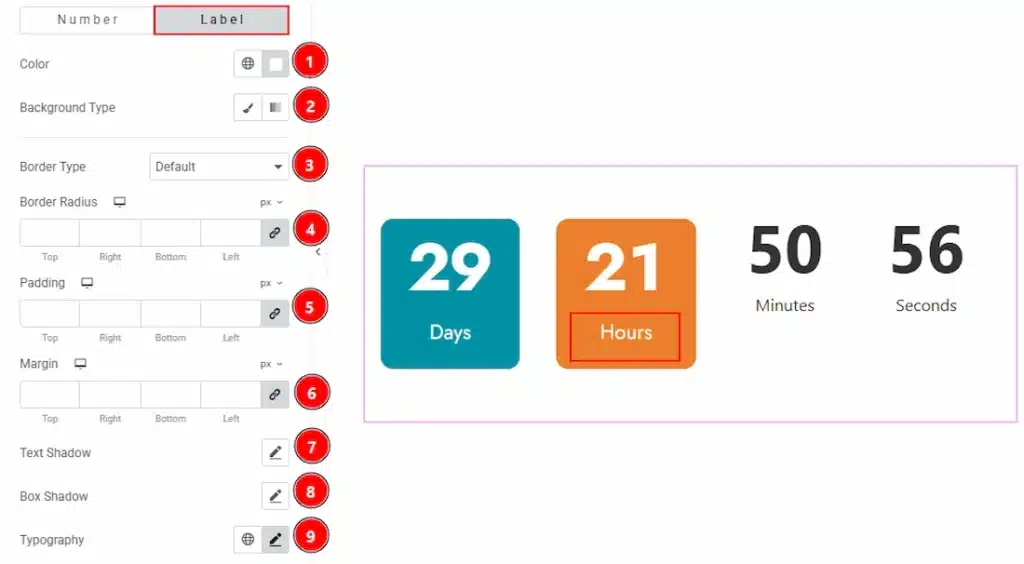
Now, let’s proceed with the Label tab-
1. Color: You can change the label color of the hours item with this option.
2. Background Type: You can choose the background type to be classic or gradient with this option.
3. Border Type: You can add and change the border types with this option.
4. Border Radius: You can control the roundness of the border with this option.
5. Padding: You can adjust the inner space of the hours item’s label with this option.
6. Margin: You can adjust the space around the label of the hours items with this option.
7. Text Shadow: You can add a shadow effect to the label text with this option.
8. Box Shadow: You can add a shadow effect to the label field with this option.
9. Typography: Change the font family, size, weight, transform, style, decoration, line height, letter spacing, and word spacing from here.
Minutes Style Section #
Go to Style → Minutes Style
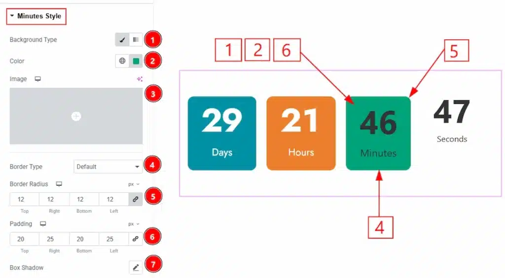
1. Background Type: You can choose the background type to be classic or gradient with this option. Here we have selected the background type as Classic.
2. Color: You can change the background color with this option.
3. Image: You can change the background image with this option.
4. Border Type: You can add and change the border types with this option.
5. Border Radius: You can control the roundness of the border with this option.
6. Padding: You can adjust the inner space of the minutes countdown item field with this option.
7. Box Shadow: You can add a shadow effect to the minutes countdown item with this option.
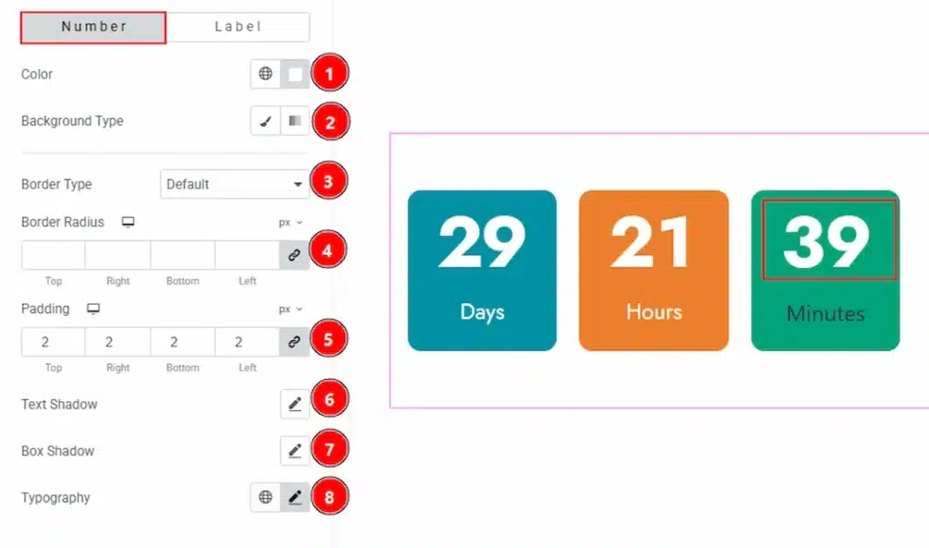
In this section, we have two more tabs. These are Number and Label. Let’s proceed with the Number tab section first-
1. Color: You can change the minutes item countdown number color with this option.
2. Background Type: You can change the background type to be classic or gradient with this option.
3. Border Type: You can add and change the border type with this option.
4. Border Radius: You can control the roundness of the border with this option.
5. Padding: You can adjust the inner space of the minutes item’s number area with this option.
7. Box Shadow: You can add a shadow effect to the minutes item’s number with this option.
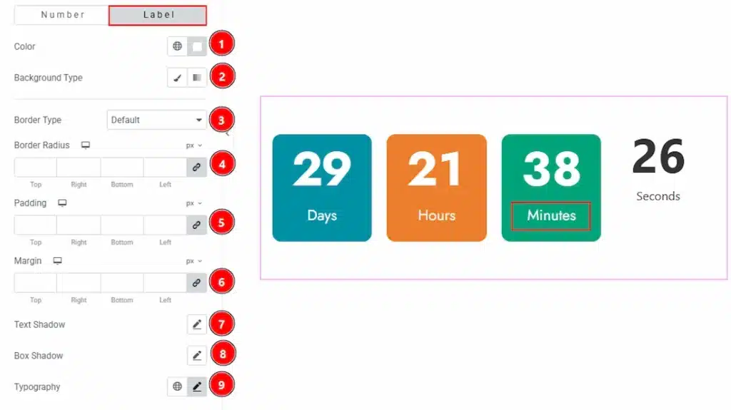
Now, let’s proceed with the Label tab-
1. Color: You can change the label color of the minutes item with this option.
2. Background Type: You can choose the background type to be classic or gradient with this option.
3. Border Type: You can add and change the border types with this option.
4. Border Radius: You can control the roundness of the border with this option.
5. Padding: You can adjust the inner space of the minutes item’s label with this option.
6. Margin: You can adjust the space around the label of the minutes items with this option.
7. Text Shadow: You can add a shadow effect to the minute label text with this option.
8. Box Shadow: You can add a shadow effect to the minute label field with this option.
9. Typography: Change the font family, size, weight, transform, style, decoration, line height, letter spacing, and word spacing from here.
Seconds Style Section #
Go to Style → Seconds Style
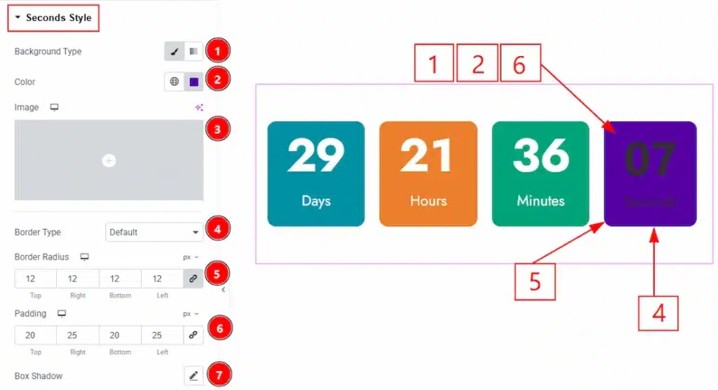
1. Background Type: You can choose the background type to be classic or gradient with this option. Here we have selected the background type as Classic.
2. Color: You can change the background color with this option.
3. Image: You can change the background image with this option.
4. Border Type: You can add and change the border types with this option.
5. Border Radius: You can control the roundness of the border with this option.
6. Padding: You can adjust the inner space of the seconds countdown item field with this option.
7. Box Shadow: You can add a shadow effect to the seconds countdown item with this option.
In this section, we have two more tabs. These are Number and Label. Let’s proceed with the Number tab section first-
1. Color: You can change the Seconds item countdown number color with this option.
2. Background Type: You can change the background type to be classic or gradient with this option.
3. Border Type: You can add and change the border type with this option.
4. Border Radius: You can control the roundness of the border with this option.
5. Padding: You can adjust the inner space of the seconds item’s number area with this option.
7. Box Shadow: You can add a shadow effect to the seconds item’s number with this option.
Now, let’s proceed with the Label tab-
1. Color: You can change the label color of the seconds item with this option.
2. Background Type: You can choose the background type to be classic or gradient with this option.
3. Border Type: You can add and change the border types with this option.
4. Border Radius: You can control the roundness of the border with this option.
5. Padding: You can adjust the inner space of the seconds item’s label with this option.
6. Margin: You can adjust the space around the label of the seconds items with this option.
7. Text Shadow: You can add a shadow effect to the seconds label text with this option.
8. Box Shadow: You can add a shadow effect to the label field with this option.
9. Typography: Change the font family, size, weight, transform, style, decoration, line height, letter spacing, and word spacing from here.
Number Section #
Go to Style → Number
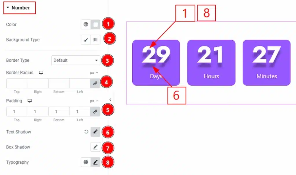
1. Color: You can make changes to all the item number with this option.
2. Background Type: You can choose the background type to be classic or gradient with this option.
3. Border Type: You can add or change the border types with this option.
4. Border Radius: You can control the roundness of the border with this option.
5. Padding: You can adjust the inner space of the numbers of the items with this option.
6. Text Shadow: You can add a shadow effect to the numbers text with this option.
7. Box Shadow: You can add a shadow effect to the number field with this option.
8. Typography: Change the font family, size, weight, transform, style, decoration, line height, letter spacing, and word spacing from here.
Label Section #
Go to Style → Label
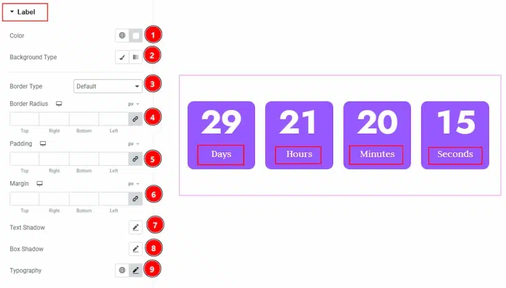
1. Color: You can make changes to all the item labels with this option.
2. Background Type: You can choose the background type to be classic or gradient with this option.
3. Border Type: You can add or change the border types with this option.
4. Border Radius: You can control the roundness of the border with this option.
5. Padding: You can adjust the inner space of the label of the items with this option.
6. Margin: You can adjust the space around the label field with this option.
7. Text Shadow: You can add a shadow effect to the label text with this option.
7. Box Shadow: You can add a shadow effect to the label field with this option.
8. Typography: Change the font family, size, weight, transform, style, decoration, line height, letter spacing, and word spacing from here.
All done! You have successfully customized the Countdown widget on your website.
Video Assist #
You can also watch the video tutorial to use the Countdown widget. The video is coming soon. Please visit the demo page for examples.
Thanks for being with us.


