
The Advanced Heading widget from Wow Elements enables you to create visually appealing and fully customizable headings for your website. It provides flexible options for titles, subtitles, separators, and animations, helping you enhance the overall presentation of your content. This documentation will guide you through using and customizing the Advanced Heading widget in Elementor.
Enable The Advanced Heading Widget #
To use the Advanced Heading widget from Wow Elements, first, you have to enable the widget.
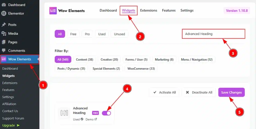
- Go to WordPress dashboard → Wow Elements Plugin dashboard.
- Then, Click the Core Widgets Tab.
- Search the Advanced Heading Widget Name.
- Enable the Advanced Heading Widget.
- Hit the Save Settings Button.
Inserting The Advanced Heading Widget #
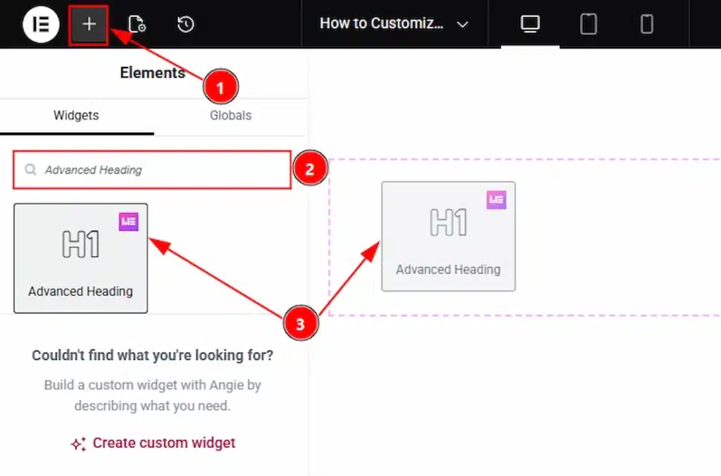
1. Go to the Elementor Editor Page and hit the “+” icon Button.
2. Search the Advanced Heading name.
3. Drag the widget and drop it on the editor page
Content Tab Overview #
Heading Section #
Go to Content → Heading
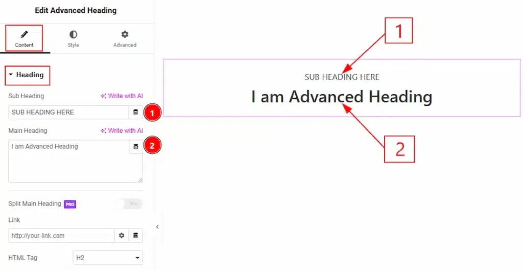
1. Sub Heading: You can make changes to the sub heading text with this option.
2. Main Heading: This option lets you change the main heading text.
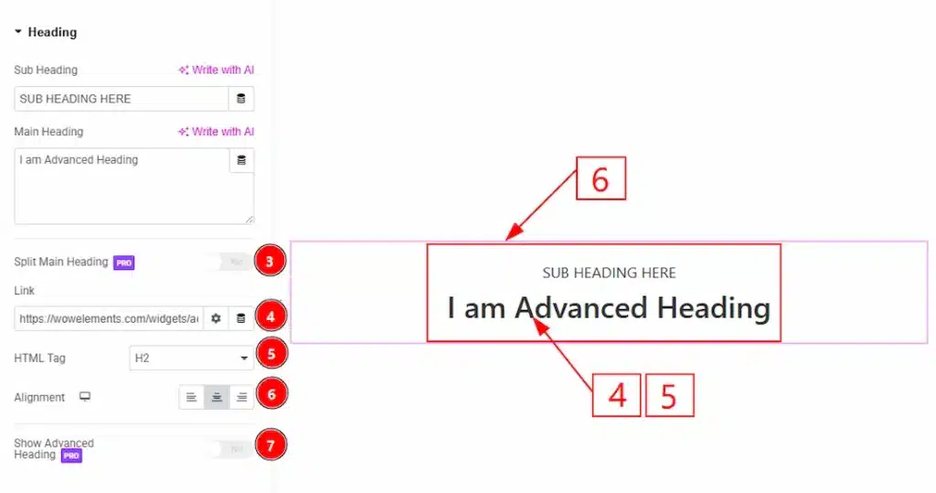
3. Split Main Heading: Enable/disable the split main heading switcher button to show/hide the split heading text. (This is a pro feature & you will be able to use it when you have the pro plan)
4. Link: You can add a link to the main heading with this option.
5. HTML Tag: You can set the title HTML tag H1 to H6 and Div, span, and P to the main heading with this option.
6. Alignment: You can set the heading Alignment- Left, Center, and Right with this option.
7. Show Advanced Heading: Enable/disable switcher to show the Advanced Heading text on the back of the heading & subheading with this option. (This is a pro feature & you will be able to use it when you have the pro plan)
Style Tab Overview #
Sub Heading Section #
Go to Style → Sub Heading
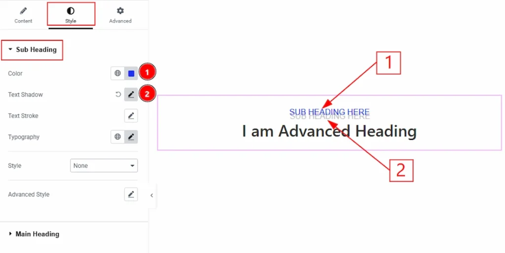
1. Color: This option lets you change the sub heading text color.
2. Text Shadow: You can a shadow effect to the sub heading text with this option.
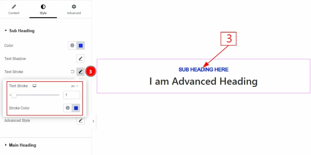
3. Text Stroke: You can add and make changes the stroke color to the sub heading text with this option.
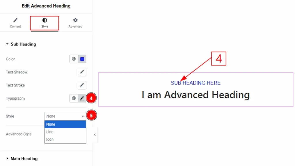
4. Typography: Change the font family, size, weight, style, transform, decoration, line height, letter spacing, and word spacing from here.
5. Style: You can set the style type- None, Line and Icon. Here we set the style type- Line.
When Style Type- Line #
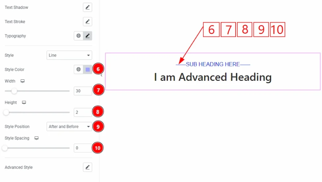
6.Style Color: You can make changes to the line style color with this option.
7. Width: You can set the width of the line with this option.
8. Height: You can adjust the height of the line with this option.
9. Style Position: You can set the line position- After, Before, After and Before, and Bottom. Here we have selected the line position as after and before.
10. Style Spacing: You can adjust the space between the line and the sub heading text with this option.
When Style Type – Icon #
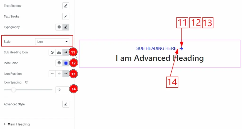
11. Sub Heading Icon: This option allows you to choose your prefer icon for the sub heading.
12. Icon Color: This option lets you change the sub heading icon color.
13. Icon Position: You can set the icon position- Left, Center, and Right with this option.
14. Icon Spacing: You can adjust the icon spacing from here.
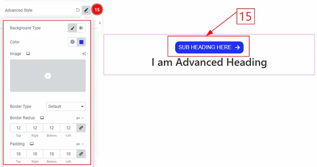
15. Advanced Style: After clicking on the Advanced Style option, you will get the Background Type, Background Color, Border Type, Border Color, Border Width, Border Radius, and padding option as like in the above screenshot.
Main Heading Section #
Go to Style → Main Heading
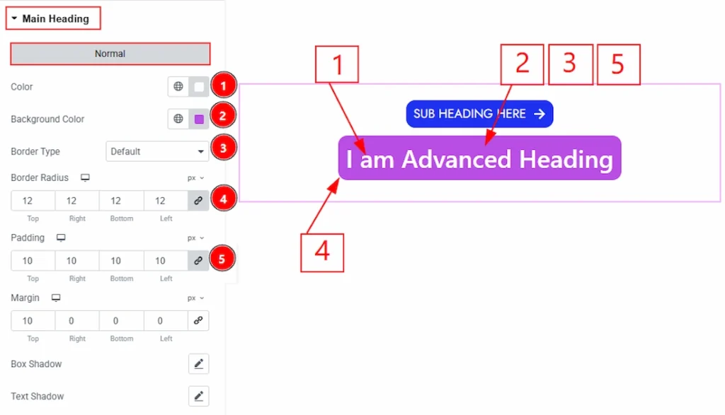
1. Color: This option lets you change the main heading text color.
2. Background Color: You can change the background color of the main heading with this option.
3. Border Type: You can add and change the border type with this option.
4. Border Radius: This option controls the roundness of the border.
5. Padding: You can adjust the inner space of the main heading field with this option.
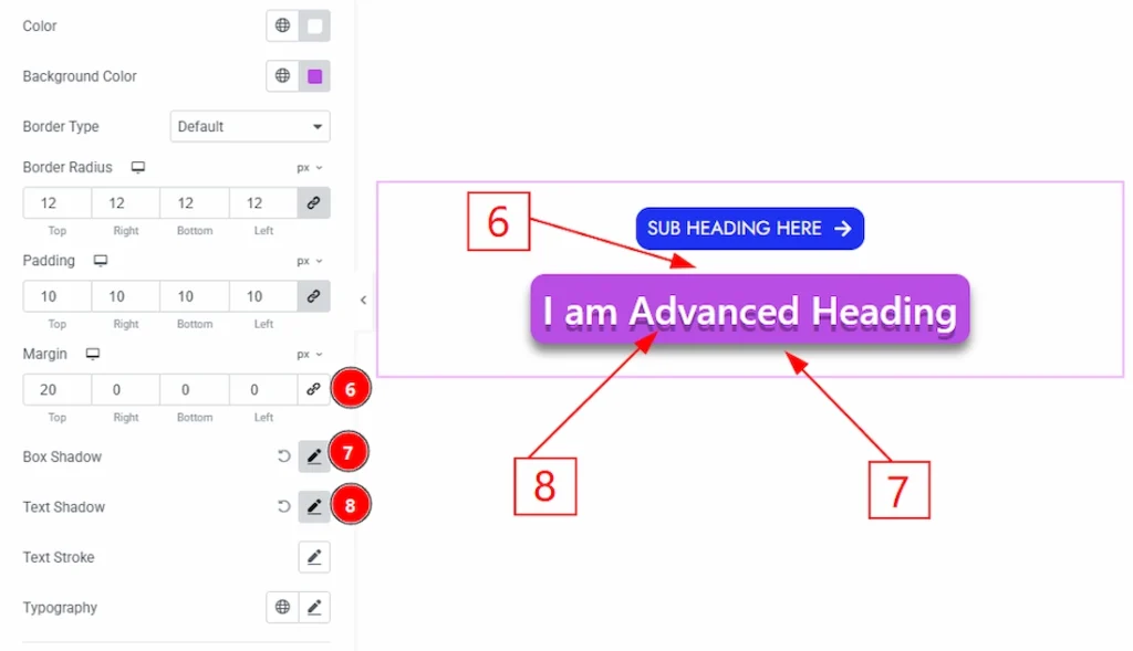
6. Margin: You can adjust the outer space of the main heading with this option.
7. Box Shadow: You can add a shadow effect top the main heading with this option.
8. Text Shadow: You can add the text shadow for the main heading from here.
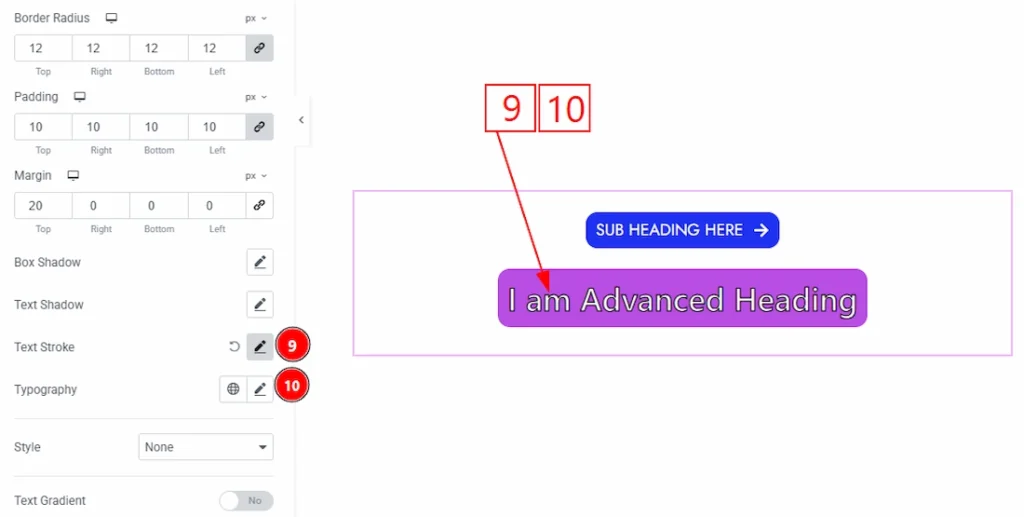
9. Text Stroke: You can add the text stroke for the main heading from here.
10. Typography: Change the font family, size, weight, style, transform, decoration, line height, letter spacing, and word spacing from here.
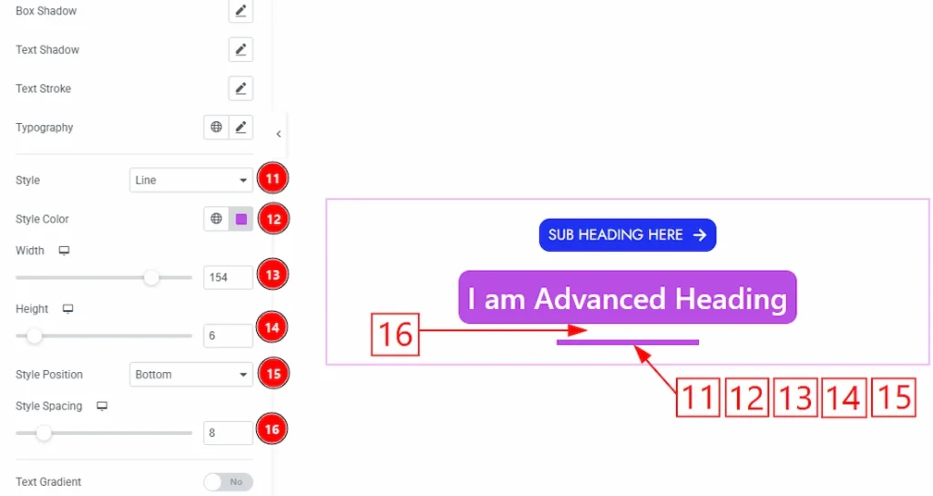
11. Style: You can select the style type- None and Line. Here, we select the style type- Line.
12. Style Color: You can change the style line color with this option.
13. Width: You can adjust the width of the line style with this option.
14. Height: You can adjust the height of the line style with this option.
15. Style Position: This option lets you set the style position- After, Before, After and Before, and Bottom.
16. Style Spacing: You can adjust the space between the line & the main heading with this option.
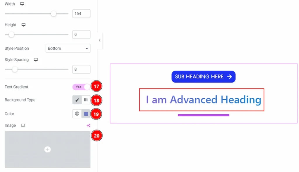
17. Text Gradient: Enable the switcher to add the gradient color to the text.
18. Background Type: You can choose the background type to be classic or gradient with this option.
19. Color: You can change the background color with this option.20. Image: You can change the background image with this option.
Video Assist #
You can also watch the video tutorial to use the Advanced Heading widget. The video will come soon. Please visit the demo page for examples.
Thanks for being with us.


